
Hebrew Script in Fashion: Why the Aleph-Bet Is Trending
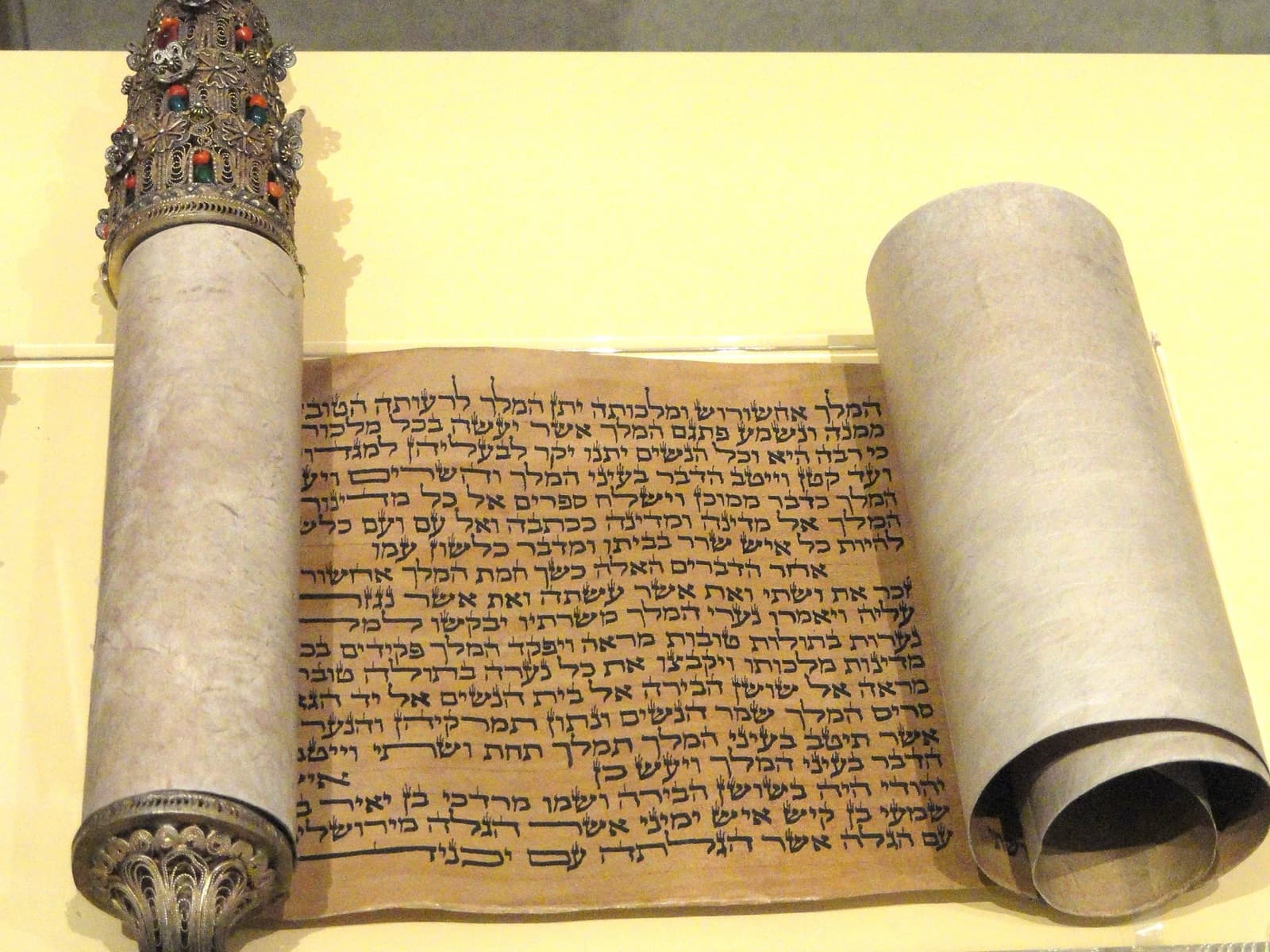
Hebrew script is one of the world's oldest continuously used writing systems, a 22-letter alphabet whose forms were shaped by scribes, stonecutters, and type designers across three millennia. Today it's showing up on streetwear, jewelry, and gallery walls, and wearing it well comes down to two things: getting the letters right, and knowing what should never go on a garment in the first place. Here's the history, the craft, and the ground rules.
We spend an unreasonable amount of time staring at Hebrew letters. Occupational hazard: we print them on shirts. And the longer you look, the more you see why designers keep falling for this alphabet. Every letter is a small piece of architecture, built from strong horizontals and delicate descenders, carrying more history per stroke than almost any letterform on earth. When someone wears a lamed or an aleph across their chest, they're wearing something older than the Roman alphabet it's walking past on the street.
Three Thousand Years in Twenty-Two Letters
The Hebrew alphabet is an abjad, a script of 22 consonants, with vowels indicated (when they're indicated at all) by a system of dots and dashes called nikud, added by the Masoretes in the early medieval period. It reads right to left, and five of its letters change shape when they end a word, the final forms known as sofit letters. Remember that detail; it becomes important when we get to what goes wrong on T-shirts.
The earliest Hebrew inscriptions were written in Paleo-Hebrew, a script adapted from Phoenician roughly three thousand years ago. The square, blocky letterforms we recognize today, called ktav Ashuri, "Assyrian script," were adopted during and after the Babylonian exile, refined by generations of scribes into the script of Torah scrolls, and they've been remarkably stable ever since. A Jew from two thousand years ago could read the lettering on a shirt from our Hebrew Script collection. Try saying that about your favorite sans-serif.
Meaning is baked in deep. Every letter doubles as a number (aleph is 1, bet is 2, and so on), which is why chai, the word for "life" spelled chet-yud, adds up to 18 and why Jews give gifts in multiples of eighteen. Letters carry stories: aleph, the silent first letter; bet, the letter that opens the Torah. Jewish mysticism went further and treated the letters as the raw material of creation itself. When designers say Hebrew letterforms feel "charged," they're picking up on a very old signal.
The Scribe's Art: Calligraphy Before Fonts
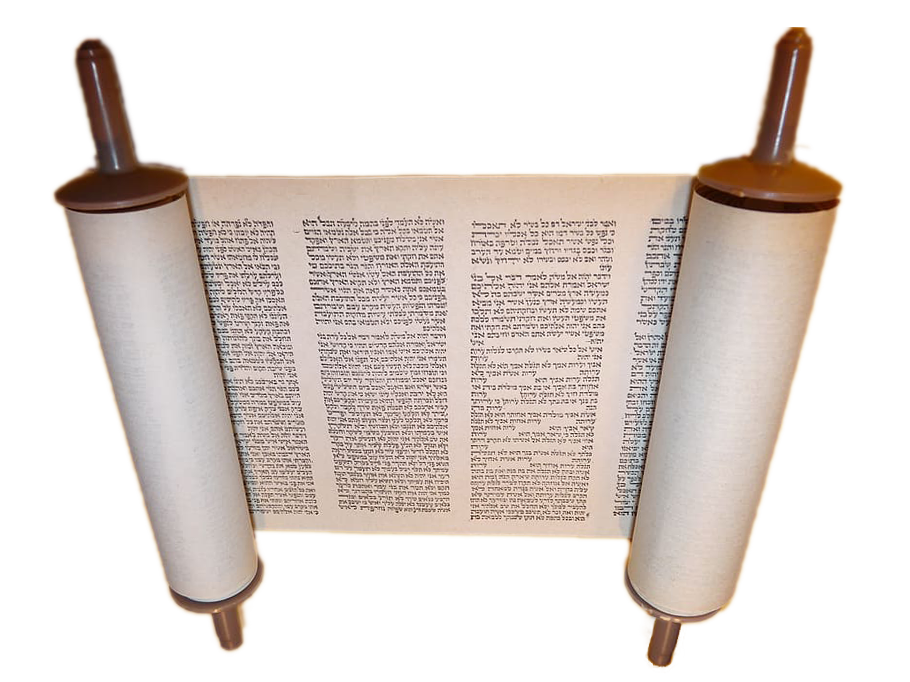 Image: Kadumago, Wikimedia Commons (CC BY 4.0)
For most of Jewish history, beautiful Hebrew meant handwritten Hebrew. The sofer (scribe) who writes Torah scrolls, tefillin, and mezuzah parchments works within a discipline called STaM, where every letter has prescribed strokes, proportions, and even decorative crowns called tagin. A single malformed letter can render an entire scroll unfit for use. It is calligraphy practiced as sacred trust, and it kept the letterforms consistent across continents and centuries.
Alongside the scribes, Jewish artists invented one of history's most delightful lettering traditions: micrography, the practice of building pictures out of miniature Hebrew text, which emerged around the ninth or tenth century. Medieval micrographers drew animals, geometric carpets, and entire scenes using thousands of tiny letters. It was typography as illustration a millennium before anyone coined the term, born partly from a culture that channeled its visual imagination through the written word.
Sephardi scribes developed rounder, more flowing hands; Ashkenazi scribes cultivated angular, Gothic-influenced ones. That regional variety became the gene pool for everything that followed, because when Hebrew met the printing press in the fifteenth century, the first punchcutters modeled their type on scribal hands.
The Typefaces That Built Modern Hebrew
Modern Hebrew typography has its own canon of classics, and their stories are worth knowing, because the odds are good you've read one of them today.
Frank-Rühl, the workhorse
Between 1908 and 1910 in Leipzig, Rafael Frank, a cantor and letter designer, created a typeface with the C.F. Rühl foundry intended to modernize Hebrew printing for secular texts while honoring traditional forms. Frank-Rühl became to Hebrew what Times New Roman is to English: the default of Israeli newspapers and books for over a century. Israelis have read so much Frank-Rühl that most couldn't name it, which is the highest compliment a text face can receive.
Koren, the sacred modernist
In 1962, the designer Eliyahu Koren completed a typeface for a new edition of the Tanakh, drawing on both Ashkenazi and Sephardi scribal traditions. The Koren Tanakh was the first Hebrew Bible edition produced entirely by a Jewish team in centuries, and its type is a masterclass in clarity and reverence, crisp enough for modern eyes, dignified enough for the text it carries.
Hadassah, the labor of love
Henri Friedlaender spent more than thirty years developing Hadassah, basing his research partly on an early-1800s Megillat Esther in his possession, and it became one of the most widely used faces in Hebrew publishing. Thirty years on one typeface. Whatever we think patience means, type designers mean something else.
And today
Contemporary Israeli and diaspora type designers have built on that foundation with a wave of new Hebrew faces, from geometric sans-serifs for tech brands to revival faces resurrecting scribal hands, and studios now routinely design Latin-Hebrew font pairs so bilingual branding can speak both languages in one voice. Hebrew lettering shows up in gallery art, tattoo culture, album covers, and, yes, fashion, worn by people who grew up with the letters and by people just discovering them.
Why Designers (and the Rest of Us) Are Falling for the Aleph-Bet
Part of it is pure form. Hebrew's letters sit under a strong horizontal shoulder line rather than standing on a baseline the way Latin letters do, which gives Hebrew text a distinctive woven, horizontal energy. There are no capital letters and no italics in the traditional sense, so emphasis and hierarchy get created through weight, scale, and spacing, constraints that force elegant solutions.
Part of it is identity. After October 7th, a lot of Jews felt a pull to be visibly, legibly Jewish in daily life, and Hebrew script is the most legible signal there is. A single chai or a name in Hebrew letters says: still here, still us. That's not a trend; that's three thousand years of stubbornness you can wear. It's also, frankly, why this company exists, and why we think pride wear should be affordable enough to actually wear daily rather than priced like a museum piece. The whole story is on our About page.
And part of it is the simple pleasure of meaning. A Latin monogram decorates. A Hebrew word says something, to everyone who can read it and to the wearer even when no one else can.
Jewelry figured this out generations ago. The chai pendant, two letters adding up to "life," has hung on Jewish necks for so long that it's practically a genre of its own, and the name-necklace in Hebrew letters predates every personalization trend the fashion industry thinks it invented. Apparel is simply catching up to what the jewelers always knew: people don't just want ornament, they want ornament that means. A letterform that has survived exile, expulsion, and the fall of empires carries a confidence no trend cycle can manufacture. Print it well, wear it proudly, and the alphabet does the rest of the work.
How to Wear Hebrew Respectfully (and Correctly)
Here's where we put on our serious face for a few paragraphs, because Hebrew on clothing comes with two responsibilities: accuracy and reverence. Both are acts of care, and both are routinely botched.
Rule one: no sacred text on garments, ever
We never print God's name or verses of sacred text (pesukim) on apparel, and we'd gently encourage everyone to hold the same line. The reasoning is beautifully practical: Jewish tradition treats the written divine name with such care that worn-out texts containing it aren't thrown away but stored in a geniza and eventually buried, like a person. A garment, by its nature, gets worn into bathrooms, dropped on gym floors, and churned through the wash. Putting sacred words there isn't edgy; it just puts something holy somewhere it can't be honored.
This isn't a limitation on design. It's a design brief. The tradition is enormous: words like chai, shalom, and ahava; names; blessing-adjacent motifs like the hamsa and pomegranate; the entire aleph-bet itself. Allusion and motif, yes; sacred text, no. We think the restraint is part of what makes the result beautiful, the same way a poem is better for having a form. It's one of the standards we hold every design to, alongside the sustainability practices covered in Our Processes.
Rule two: verify every letter
The internet is a museum of Hebrew gone wrong: tattoos with letters mirrored left-to-right, shirts using a mid-word form where a final sofit letter belongs, phrases run through machine translation that came out meaning nothing, and Hebrew typed in software that didn't support right-to-left text, printing the whole word backwards. These mistakes happen because Hebrew punishes guesswork: the direction is reversed, five letters shape-shift at word endings, and a single dot can change a meaning.
The fix is unglamorous: have someone who actually reads Hebrew check the final artwork, not the draft, the final file, after every export and mockup. We verify spelling, directionality, final forms, and nikud (when we use it at all) before anything gets printed. If you're buying Hebrew apparel anywhere, it's fair to ask whether the seller did the same. A word worn wrong is worse than no word; a word worn right is a small act of respect performed in public, all day long.
Rule three: wear it like it's yours, because it is
Hebrew script isn't a costume or an aesthetic filter; it's a living alphabet with a community attached. Worn with knowledge, it's one of the most meaningful things you can put on. Know what your shirt says. Be ready for the best kind of stranger interaction, the double-take followed by "wait, what does that mean?" That conversation is half the fun.
FAQ
Is it disrespectful to wear Hebrew letters on clothing?
Not inherently, and Jews have adorned objects with Hebrew lettering for millennia. The lines that matter: no divine names or sacred verses on garments (clothing gets worn everywhere and washed), correct spelling and directionality, and knowing what your garment says. Meet those and Hebrew apparel is a celebration, not a transgression.
Why won't Kosher Couture print God's name or Torah verses on a shirt?
Because garments live a garment's life: bathrooms, laundry, gym bags. Jewish tradition buries worn-out sacred texts rather than discarding them, and that level of care can't be given to a T-shirt. We treat the rule as a mark of love for the words, not a restriction on creativity.
How can I tell if Hebrew on a product is spelled correctly?
Check three things: the text reads right to left, any word-final letter uses its sofit form (ך ם ן ף ץ), and the word actually appears that way in a dictionary or from a fluent reader. When in doubt, ask the seller who verified their Hebrew; a good one will have an answer.
What are the most famous Hebrew typefaces?
Frank-Rühl (Rafael Frank, 1908–1910) dominates Israeli books and newspapers; Koren (Eliyahu Koren, completed 1962) set the modern standard for sacred texts; Hadassah (Henri Friedlaender, three decades in the making) became a publishing mainstay. Contemporary designers keep adding to the canon.
Does Hebrew have uppercase and lowercase letters?
No. Hebrew has one case, though five letters take a different final form at the end of a word. Emphasis in Hebrew typography comes from weight, size, and spacing instead, which is part of the script's clean, even texture on a page or a shirt.
The aleph-bet has been waiting three thousand years for its fashion moment; come see what it looks like in the Hebrew Script collection.


